Visual Stories that Transform Audit Speak into Engaging, Understandable Reports


Auditors love words! Having served as an auditor for more than 10 years, it seems that words tend to be a source of comfort and confidence, and we, as auditors, rely on words when attempting to get our message across to readers. At the same time, we realize those reading our reports are probably suffering from information overload and are, most likely, not as text-driven as we are. The Auditor General of Finland’s Supreme Audit Institution (SAI), Ms. Tytti Yli-Viikari, appealed to SAIs to place stakeholders at the center of audit work. But, how do we do this? How do we best reach our audience?
Like most auditors, I am not a graphic designer or communications specialist; however, I have been creating visual stories using tools, such as infographics, animations and data visualizations for several years. Visuals aren’t just pretty pictures that go with text. They are rooted in information and visual design and are used to analyze, convince or explain. While visuals should be aesthetically pleasing, designing visual stories is more about conveying how things work, and they should make the information in audits understandable and engaging.
The best visual stories should be a sum of two processes—discovering and telling. As shown in the pyramid graphic, these two processes can be combined using theories on data, information and knowledge.
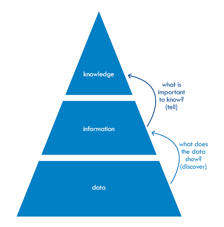
By using structure, hierarchy and relationships, data is transformed into information. This transformation (information design) represents a visual story’s foundation—determining important elements, defining key messages, and using visual elements to engage the audience.
Information Design, Visual Design: The Bases for Visual Stories
Information design is a foundation for both visual stories and audit work. Whether it’s a question of making a flow chart, categorizing data, or mapping and plotting, many auditors already employ aspects of information design. But how can we transform these individual aspects into a full visual story?
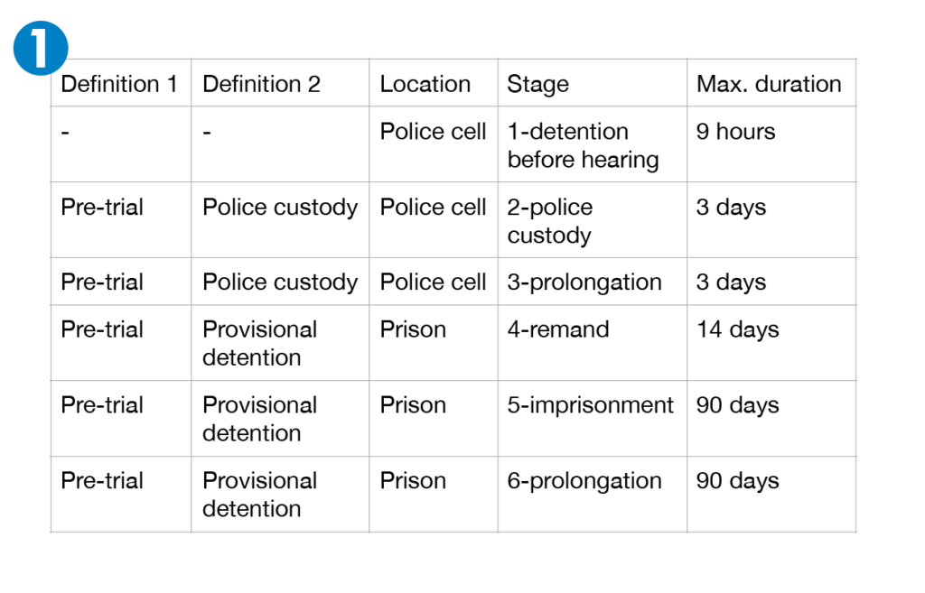
We created a four-step process using a practical example from a previous audit on pre-trial detention.
Step 1: The audit team delivered a table outlining the various pre-trial detention definitions.
Step 2: Hierarchy and relationships were added to make the information easier to understand (information design).
Step 3: Visual elements (color coding, icons) were incorporated throughout the report to emphasize differences.
Step 4: We then turned to the art of visual design and included visualizations representing duration (tick marks and a figure of a person waiting).
Though it was a full-page, it made the information easier to understand (structure), helpful (consistent color coding, icon usage throughout), and engaging (grabbed the reader’s attention).
More Than Just a Pretty Picture
Visual stories are important in effectively communicating with stakeholders. A picture is worth a thousand words, which means a lot to the auditing community. But it is more than just supplying a pretty picture. It’s about impact. It’s about reaching out to our audience. It’s about making our stakeholders care.
Visual stories based on human-centered design that originate from content-centered audits provide all of that; however, creating visual stories that truly match report complexity means that we, the auditors, need to start designing. Working with designers (co-creating visuals) can help prevent visual stories that are too flattened or too complex.
When Visual Stories Work
Visual stories offer numerous benefits: immediate impact; the ability to grab a reader’s attention; creating a more understandable topic for a wider audience.
A design research method developed during an audit on product safety provides an excellent example of employing visual stories to realize these benefits. The success of this innovative process was largely due to the early integration of stakeholders.
The European Commission collects notifications on all products bearing a safety (“CE”) marking that have been found potentially unsafe for consumers. This involves an extraordinary amount of data. Such a tough topic needed help in gaining stakeholder attention, prompting us to develop effective visuals, as well as redesign our product (our audit).
We set out to give the safety marking data a “face” to make decision makers care about the topic. To better grab the reader’s attention and make the topic more understandable, two unsafe products were selected as examples, and their journeys from supplier to consumer were visually mapped. This method generated valuable insights into how the system works. It also helped create a number visual stories to convey the message, which were used by journalists in reporting on the audit.
Additional Information
For a full list of references or more general information on this topic, contact the author at L.Meijer-Wassenaar@rekenkamer.nl. To learn more about the author’s experience in developing visual stories, visit http://auditinvorm.nl/how-to-discover-and-tell-visual-stories-in-audits/.
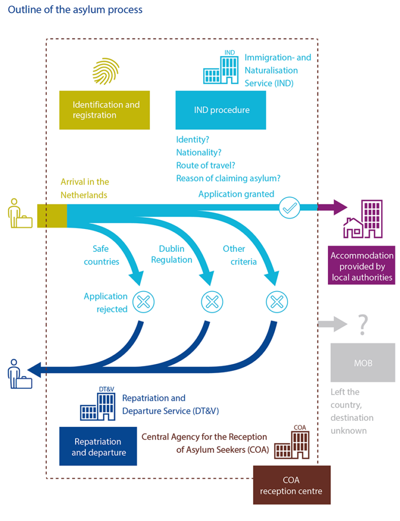
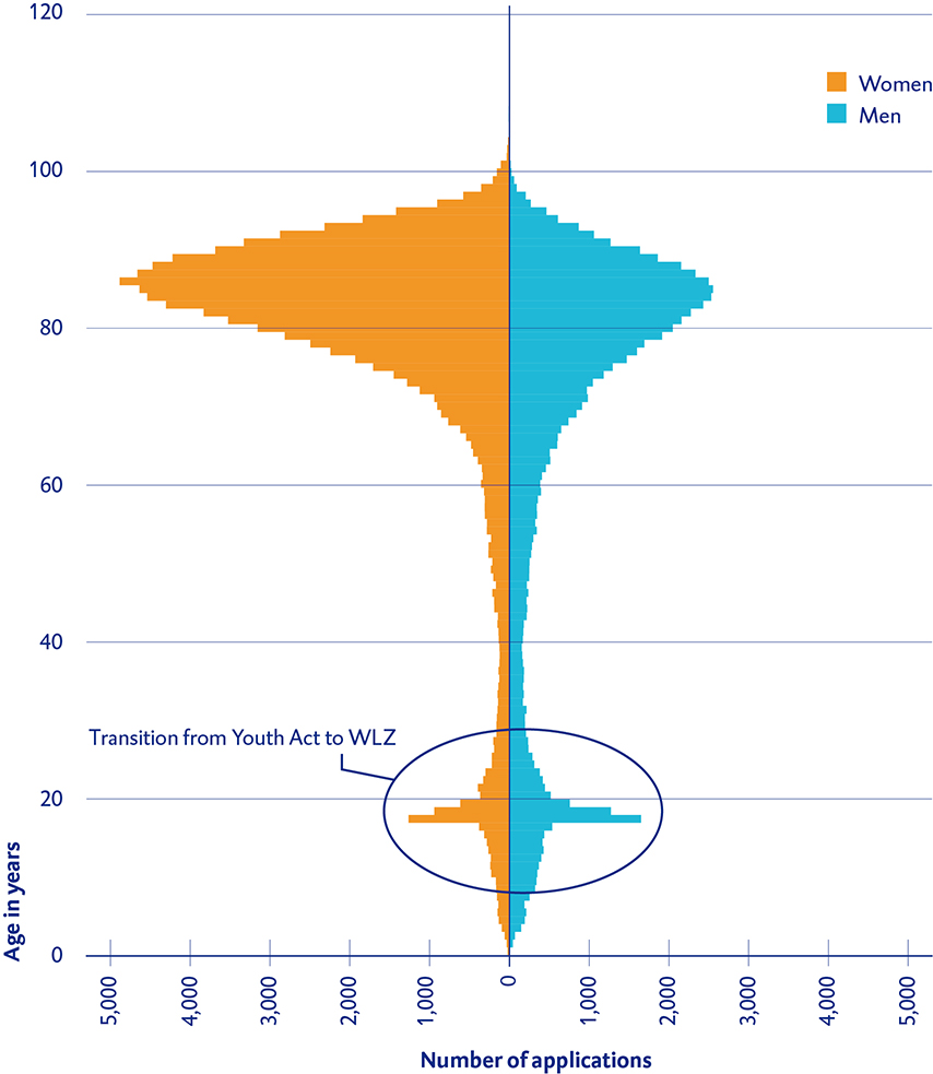
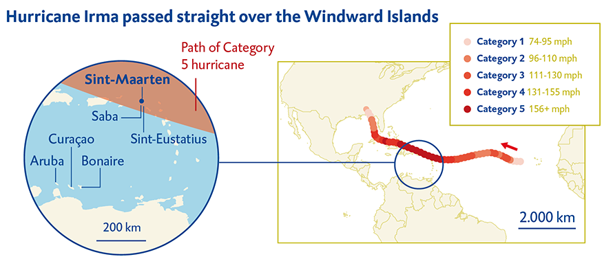
Additional Visual Story Examples